Style Guide
Style Guide
Browse all the basic styles and components inside this UI Kit
Typography
Typography is the foundation of this template. Every style is set up to build clear hierarchy, keep content easy to read, and stay consistent across every page — from large display headings down to the smallest captions. Use the styles as they are, or adjust them to match your brand voice.
Text style
Size
Line Height
Weights
H 2XL
120
120px
Default,Medium,Semibold
H1
80
120px
Default,Medium,Semibold
H2
56
130px
Default,Medium,Semibold
H3
48
140px
Default,Medium,Semibold
H4
40
150px
Default,Medium,Semibold
H5
32
140px
Default,Medium,Semibold
H6
24
130px
Default,Medium,Semibold
Body Text
Lead
20
30px
Default,Medium,Semibold
Large
18
28px
Default,Medium,Semibold
Medium
16
24px
Default,Medium,Semibold
Small
14
20px
Default,Medium,Semibold
Colors
The color system here is functional first, decorative second. It runs on a small set of neutrals for structure, plus a couple of accents to draw attention where it counts. Contrast and usability come before anything else. You'll find colors for surfaces, text, borders, and highlights — all designed to work together right out of the box, but easy to customize for your own brand.
Buttons
Buttons are built to be clear and predictable. Primary actions stand out and guide the user forward, while secondary and tertiary buttons support the flow without competing for attention. The goal: users always know what to do next, without having to think about it.
Primary
Icons
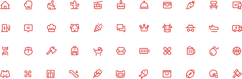
Icons are designed for quick visual recognition and consistent hierarchy. Simple, purposeful vector shapes ensure clarity at any scale without cluttering the interface — use these as standard defaults, or swap in custom sets to match your project's distinct voice.
Ready to Build Your Dream Home?
Get an accurate, no-obligation cost estimate for your project.